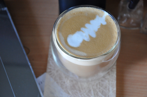
Although Melbourne Coffee Review doesn’t think much of coffee art, I am still out to perfect it. There are difficulties with home machines in getting the milk right (ie. hot enough, quickly enough) but this morning I must have done something right, as the picture suggests; should my technique have been slightly better perhaps we would’ve seen the elusive free pour leaf (which is the the one and only goal – until I reach that and find something else I’d like to do).
So to clarify, I don’t work as a barista – although I recently indulged in a course that was fun and taught me a little more than I knew already. I’d rather work as a designer once I finish this last semester of uni, being a barista might possibly be the temporary fall back plan in case I wind up living out in woop-woop (That story to come when I’m allowed to share it) although I’d probably try wedge myself into some kind of photography job if that ever occurs.
Espresso tips:
- Own a grinder with grind settings… (one day, one day). However the coffee you can make with pre-ground, if you’re careful can be okay, so do proceed.
- Buy Fairtrade
- Grind the beans yourself (see the first and last point – I don’t do this and it makes me sad)
- White dots in the lovely brown crema shouldn’t be there! (see point 1)
- 30 second extraction for 30mls of espresso (see point 1 – not usually or always possible with pre-ground)
Milk frothing tips:
- Hot, fast steam wand
- No noise after the initial, ‘put the wand in the milk’
- Use a milk thermometer if you have no idea, or your heat tolerance in your hands clearly isn’t high enough (like mine)
- If you don’t use a thermometer, heat your milk until you can’t touch the jug and maybe give it a tiny bit extra
- If you can smell your milk you’ve burnt it
- Sit the wand just under the surface at the top of the milk and NOT so it bubbles
- Do not freaking wave the jug up and down, it should just sit there.
- Milk should be smooth and silky and not have air bubbles
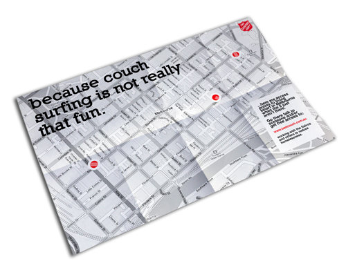
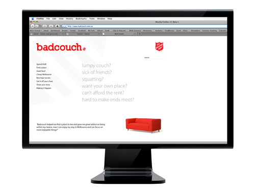
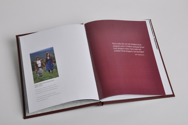
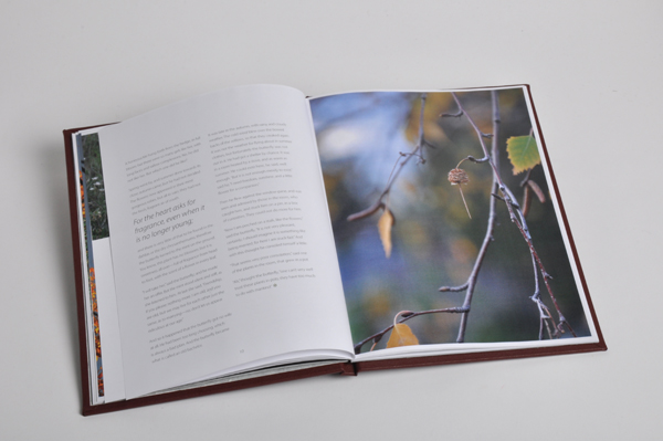
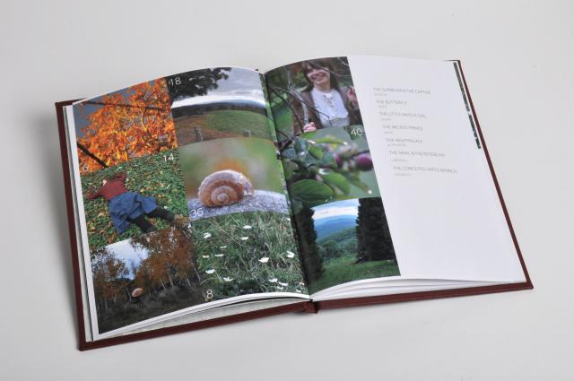
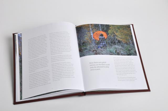
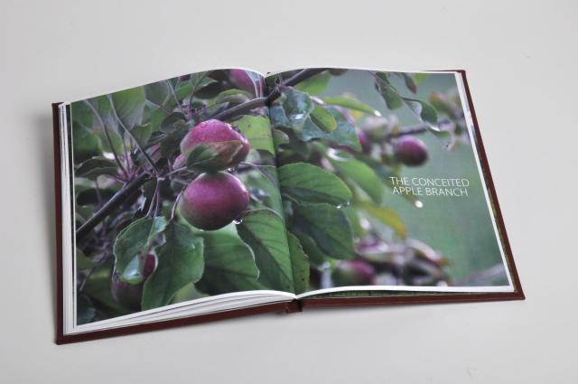
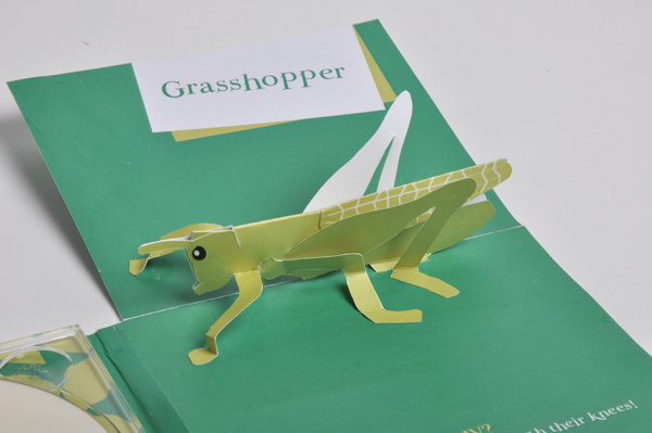
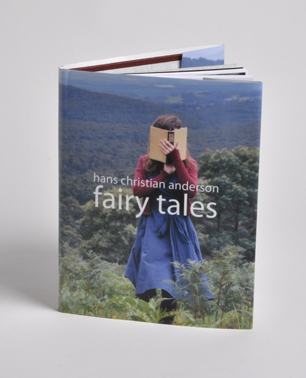 I did a publication design class this semester. Probably not quite as much info on being exuberant within the book space as I would’ve liked – they talked far more about magazines. I’m interested in book design and I’d love to be more experimental rather than conventional but I am hesitant probably because I value the integrity of the text… which is why I don’t like David Carson (Typographer). You see these marvelous book designs but the book becomes a work of art (or a mess) and no longer a book and I kind of don’t see the point… So, the assignment option was either a book or a magazine. My 10,000 words was a selection of Hans Christian Anderson stories. I also chose to generate my own images – you didn’t have to. Thought I’d have some fun with photography – some of which you have seen previously. Anyway, below are a few of the book spreads.