Skip to content

all said and done

  • Home
  • About
  • Archives
  • Photography
  • Pinterest
Home > branding
Published May 28, 2009 by Rebecca Matheson

Food is fertiliser (and a logo)

I have just completed my Design & Business class (That’s one down, yay!) it was not what I had expected, not quite what I was hoping for and a certainly scored a group with some peculiar dynamics…

Our business plan wound around this idea of converting food scraps from restaurants into organic fertiliser: yes it can be done, our focus was on the service of waste removal and forging links between the food and farming industries. This is the logo I designed for Waste Organics… it was done quickly (it’s not quite even) and the idea to me still seems a little too cutesy or something that resonates with the word flabby – but it probably works for what it is. The kind of nice irony is that apparently ‘dandelions are a logo design trend for 2009‘ – I did not know this before today. There is also a secondary version with the forks growing – for the future projection with farming involvement.

I am truly glad to see the tail end of this class, it tried my patience no end and I did have to do a lot of the work, but all up it was a kind of pleasing outcome. Cheers and good riddance.

Print

Branding Design Sustainable Uni

branding communication design Design sustainability Uni waste management

Published February 26, 2009 by Rebecca Matheson

Brand Launch – MECS, BSRT

horizontal_v1_c_rgb

Today – finally – is the launch of the new MECS brand. Initially the project was part uni assignment that I coupled with a pitch and managed to get the job! For the last little while I have been working on their signage and stationery and as soon as I get given copies, and the signs are put up – I will share some photos. Note to the locals: I’m not responsible for the car stickers or the open day signs… just the other stuff.

This is the logo, by way of explanation it is:

  • An abstraction of three people in conversation, this ties in with both a community focus and home-school partnership.
  • A tree, representative of growth and suitable for the Yarra Ranges environment.
  • Pathways, indicative of MECS providing direction and leading students through their time at school.
  • And to a lesser extent the addition of five colours is reflective of 5 values (which I cannot pull off the top of my head at this very moment).

The logo has undergone several transitions from where I left it and a huge number from where it started. The one submitted to uni used an entirely different typeface and was one-colour, the placement was also closer to the secondary vertical version. The typeface in use now is Fontin it suits the school better than the previous one, it also makes my life easier because it is of superior quality and can be used more widely.

Secondary vertical version:

vertical_v1_c_rgb

This morning the school had a brief morning tea to officially kick off the branding. I am really happy with the outcome, it feels right for the school. Here’s to hoping I get to dig my hands into their website in the next few months. In the mean-time I have picked up another job doing a website revamp for a pharmacy.

I am not sure if I have talked much about concluding my time working at Ergo Consulting. I am in the handover process and will be finished by the end of March it seems the timing is really good. I’ve loved working with Ergo and learnt a huge amount while I’ve been there – not only in administration/design but about the business world. They are exceptional people to work for. This year however, I need to focus on uni a bit more and want to keep doing this freelancing stuff to get some experience under my belt.

On the design note, I have also just finished the Business Sustainability Round Table website (Work through Ergo) – the focus of all my IE complaints via Twitter of late. The fun area is in the member section (Which you aren’t allowed to go to!) and I got to dig around and make useful various plugins and php. I also created the BSRT logo – the pyramid is to do with some business model/a leaf shape for sustainability, the ’round’ bit is quite literal for ’round table’, you could say it is globe’ish too, but that could be taking things a bit far. A brochure is currently getting printed, photos to come of that too.

Print

Branding Culture Design Life Uni Web Design Work

branding bsrt business sustainability round table Design logos mecs mount evelyn christian school website

Published November 10, 2008 by Rebecca Matheson

Sucessful pitching, happy branding day!

I mentioned a while back that I was doing an assignment on branding and my focus was on branding my old school.

After spouting out many ideas, going through the process of refining and pitching, and pitching against other designs (which I haven’t seen btw) MECS have chose my design to rebrand with!!!

This is quite a big deal.

I’m not showing the logo yet as there is some finnessing to do at their discretion, but pleased to say I just landed my first big gig that is fairly high profile for the area and I’m rather estatic about it!!!!

Branding Design Life Uni Work

branding Design designer job resume happiness school Work

Published October 28, 2008 by Rebecca Matheson

Design and the pitching process

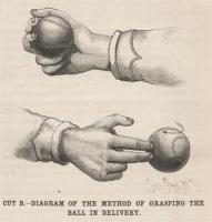
cutbA small note to commemorate my first official branding/design work pitch. The sweet day of irony that began with a lecture on… you guessed it, pitching.

It went quite well, with some great discussion around my ideas, there was a small moment where someone thought that the brand vaguely resembled a penguin, but it passed. All around, it was an excellent learning experience, that has basically put legs on a heap of stuff that we’ve been talking about at uni. Nothing is official yet, but I am optimistic that it will progress to the next level.

For those who are less familiar with the world of design, there is this little thing (actually freaking huge, but they don’t tell you until it’s too late) when you do design that involves your momentary transformation into a sales guru, otherwise, you don’t get work or, at least don’t get good work. The realm of pitching is not exclusive to freelancing, it is rampant in the design industry… basically standard practice. Why I’d never thought about it until relatively recently, beats me… but work certainly can’t keep falling in your lap forever, eventually your friends run out of things for you to do.

I’ll take this moment to mention the slightly ginormous proposal I am working on for my Managing Design class. The subject is entirely composed of developing a concept based on Future Melbourne, managing a project, writing a proposal and pitching it at various stages through the semester. As a team effort, it’s surprisingly been (quite honestly) great fun, I am in a diverse but generally hard working group of 4 (myself included) and am enjoying being Team Leader. As person with the keenest writing skills I have also taken on the task of writing the increasingly lenghty document while the others do hard yards in further research and 3D modelling (We’re working with both Multimedia and Industrial Design students). My tutor has come excruciatingly close to convincing me to get excited about public speaking. It’s good to be able to step up and feel comfortable and natural leading while maintaining a level of ‘stretch’. Because there are Tuesdays where I sit in class not fully feeling the 100% get up and go.

Pitching requires confidence. It’s not the easiest of things having your ideas and work bandied around as you sit there, and I’ve barely even begun to experience it, but surely it brings a kind of integrity to the work and helps designers not to dance to their own irrelevant little tune and chase down the thousands of loose ends that do exist. I think design in teams is an incredibly useful thing to employ. 8 eyes see much more than 4 and have exponentially greater the number of ideas.

image source
Branding Design Uni

branding Design pitching the pitching process

Published September 5, 2008 by Rebecca Matheson

Sorry state

The current state of the world in regards to school logos is utterly appalling. Every designer should cry, and cry and cry some more, and then get busy in doing something to remedy the situation.

This is my chance: MECS

This is my branding project (so a uni assignment) as it so happens, it may or may not result in my final solution being used as their new logo. They have other designers at work.

So I have the privilege of creating ‘new’ identity for my lovely old school to draw it out of the 90’s and into the light. I had a meeting with the principal this morning. Now it’s all heads down to work (I currently only have one of those… so it’ll be working triple time).

The shields in 95% of school logos are the only thing protecting the stakeholders getting shot. No more freaking shields!

Branding Create Design Life Uni

branding logos mecs research

1 2 Next »

Recent Posts

  • Fizzy Lifting Drink
  • Time is an arkenstone
  • Faithful to that wistful longing
  • Observing Life
  • Caravan Park

all said and done

Ignite WordPress Theme by Compete Themes.