Skip to content

all said and done

  • Home
  • About
  • Archives
  • Photography
  • Pinterest
Home > Design
Published May 28, 2009 by Rebecca Matheson

Food is fertiliser (and a logo)

I have just completed my Design & Business class (That’s one down, yay!) it was not what I had expected, not quite what I was hoping for and a certainly scored a group with some peculiar dynamics…

Our business plan wound around this idea of converting food scraps from restaurants into organic fertiliser: yes it can be done, our focus was on the service of waste removal and forging links between the food and farming industries. This is the logo I designed for Waste Organics… it was done quickly (it’s not quite even) and the idea to me still seems a little too cutesy or something that resonates with the word flabby – but it probably works for what it is. The kind of nice irony is that apparently ‘dandelions are a logo design trend for 2009‘ – I did not know this before today. There is also a secondary version with the forks growing – for the future projection with farming involvement.

I am truly glad to see the tail end of this class, it tried my patience no end and I did have to do a lot of the work, but all up it was a kind of pleasing outcome. Cheers and good riddance.

Print

Branding Design Sustainable Uni

branding communication design Design sustainability Uni waste management

Published February 26, 2009 by Rebecca Matheson

Brand Launch – MECS, BSRT

horizontal_v1_c_rgb

Today – finally – is the launch of the new MECS brand. Initially the project was part uni assignment that I coupled with a pitch and managed to get the job! For the last little while I have been working on their signage and stationery and as soon as I get given copies, and the signs are put up – I will share some photos. Note to the locals: I’m not responsible for the car stickers or the open day signs… just the other stuff.

This is the logo, by way of explanation it is:

  • An abstraction of three people in conversation, this ties in with both a community focus and home-school partnership.
  • A tree, representative of growth and suitable for the Yarra Ranges environment.
  • Pathways, indicative of MECS providing direction and leading students through their time at school.
  • And to a lesser extent the addition of five colours is reflective of 5 values (which I cannot pull off the top of my head at this very moment).

The logo has undergone several transitions from where I left it and a huge number from where it started. The one submitted to uni used an entirely different typeface and was one-colour, the placement was also closer to the secondary vertical version. The typeface in use now is Fontin it suits the school better than the previous one, it also makes my life easier because it is of superior quality and can be used more widely.

Secondary vertical version:
vertical_v1_c_rgb

This morning the school had a brief morning tea to officially kick off the branding. I am really happy with the outcome, it feels right for the school. Here’s to hoping I get to dig my hands into their website in the next few months. In the mean-time I have picked up another job doing a website revamp for a pharmacy.

I am not sure if I have talked much about concluding my time working at Ergo Consulting. I am in the handover process and will be finished by the end of March it seems the timing is really good. I’ve loved working with Ergo and learnt a huge amount while I’ve been there – not only in administration/design but about the business world. They are exceptional people to work for. This year however, I need to focus on uni a bit more and want to keep doing this freelancing stuff to get some experience under my belt.

On the design note, I have also just finished the Business Sustainability Round Table website (Work through Ergo) – the focus of all my IE complaints via Twitter of late. The fun area is in the member section (Which you aren’t allowed to go to!) and I got to dig around and make useful various plugins and php. I also created the BSRT logo – the pyramid is to do with some business model/a leaf shape for sustainability, the ’round’ bit is quite literal for ’round table’, you could say it is globe’ish too, but that could be taking things a bit far. A brochure is currently getting printed, photos to come of that too.

Print

Branding Culture Design Life Uni Web Design Work

branding bsrt business sustainability round table Design logos mecs mount evelyn christian school website

Published February 18, 2009 by Rebecca Matheson

Ampersand

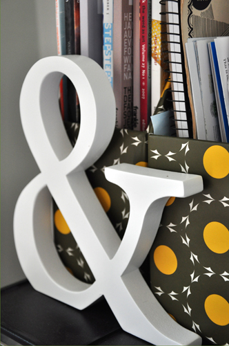
ampersandI am in two minds about the ampersand, they are incredibly beautiful, curvy, interesting, and can feature alone, but on the other hand, they are a quite a lazy character. They rip the letters A N D off and they are often used at inappropriate moments. It’s the & of the headline and not the and of the story.

If you don’t take the metaphor too far, you could say that this blog has progressed (or degressed) from:

All Said and Done

to

All Said & Done

The blog might have grown up or at very least aged, but it has certainly gotten more lazy, it is less about the story. This is not necessarily a bad thing, but more reflective of how All Said & Done fits into my life as opposed to a few years ago.

Aside:

I do quite like the ampersand. And the one sitting on my desk makes me quite happy as it really does serve no purpose whatsoever.

This guy is even mesmerised by them.

Blogging Design Life

& All Said & Done ampersand Blogging Design

Published November 14, 2008 by Rebecca Matheson

Polyvore

Oh the innovation!

Ployvore is glorious!

I’ve never been one of great skill with fashion as I cannot usually bring myself to spend the $’s it often needs, nor do I seem to have the ultimate knack. But this is a collage making tool. And a tool that lets you share them after you’ve created them. AND then lets those who browse, click on each item to take you to exactly where they’ve found the image. This is equivalent to endless inspiration! Stunning colour combinations and plenty of drool.

Go and drool and then come back and share your inspiration.

link find thanks to Oh Happy Day

Create Culture Design

collage colour Design every girl's dream fashion polyvore

Published November 10, 2008 by Rebecca Matheson

Sucessful pitching, happy branding day!

I mentioned a while back that I was doing an assignment on branding and my focus was on branding my old school.

After spouting out many ideas, going through the process of refining and pitching, and pitching against other designs (which I haven’t seen btw) MECS have chose my design to rebrand with!!!

This is quite a big deal.

I’m not showing the logo yet as there is some finnessing to do at their discretion, but pleased to say I just landed my first big gig that is fairly high profile for the area and I’m rather estatic about it!!!!

Branding Design Life Uni Work

branding Design designer job resume happiness school Work

1 2 … 6 Next »

Recent Posts

  • Fizzy Lifting Drink
  • Time is an arkenstone
  • Faithful to that wistful longing
  • Observing Life
  • Caravan Park

all said and done

Ignite WordPress Theme by Compete Themes.